pacman::p_load(ggHoriPlot, ggthemes, tidyverse)In-class Exercise 6 : Horizon Plot
20.1 Overview
A horizon graph is an analytical graphical method specially designed for visualising large numbers of time-series. It aims to overcome the issue of visualising highly overlapping time-series as shown in the figure below.
20.2 Getting Started
Before getting start, make sure that ggHoriPlot has been included in the pacman::p_load(…) statement above.
20.2.1 Import Data
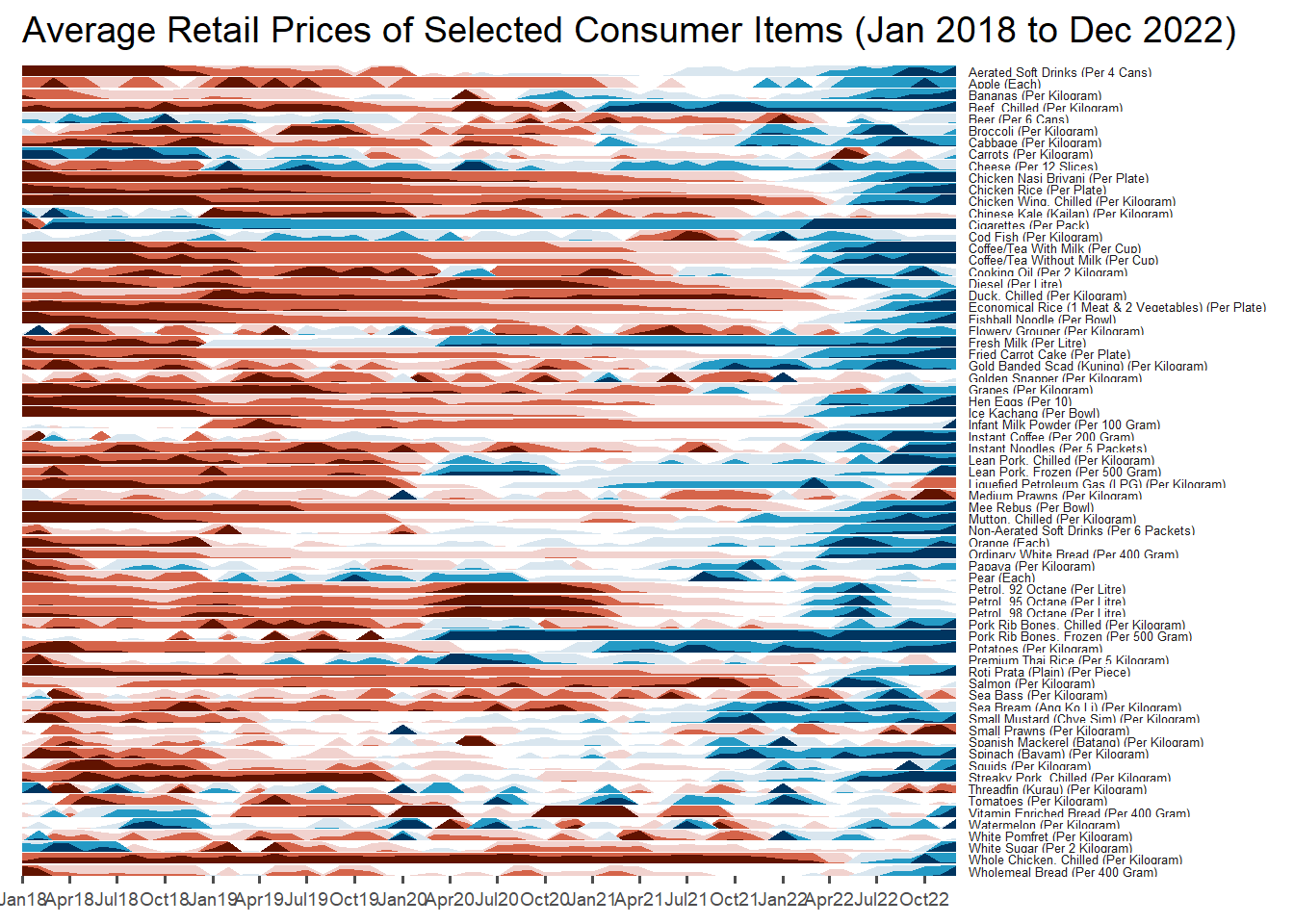
For the purpose of this hands-on exercise, Average Retail Prices Of Selected Consumer Items will be used.
Use the code chunk below to import the AVERP.csv file into R environment.
averp <- read_csv("data/AVERP.csv") %>%
  mutate(`Date` = dmy(`Date`))
:::callout-Things to Learn By default, read_csv will import data in Date field as Character data type. dmy() of lubridate package to palse the Date field into appropriate Date data type in R. :::
20.2.2 Plotting my Horizon Graph
Next, the code chunk below will be used to plot the horizon graph.
averp %>%
  filter(Date >= "2018-01-01") %>%
  ggplot() +
  geom_horizon(aes(x = Date, y=Values),
               origin = "midpoint",
               horizonscale = 6)+
  facet_grid(`Consumer Items`~.) +
    theme_few() +
  scale_fill_hcl(palette = 'RdBu') +
  theme(panel.spacing.y=unit(0, "lines"), strip.text.y = element_text(
    size = 5, angle = 0, hjust = 0),
    legend.position = 'none',
    axis.text.y = element_blank(),
    axis.text.x = element_text(size=7),
    axis.title.y = element_blank(),
    axis.title.x = element_blank(),
    axis.ticks.y = element_blank(),
    panel.border = element_blank()
    ) +
    scale_x_date(expand=c(0,0), date_breaks = "3 month", date_labels = "%b%y") +
  ggtitle('Average Retail Prices of Selected Consumer Items (Jan 2018 to Dec 2022)')